Sunday, May 8, 2011

Business Credit Expanision and Economic Recovery in Canada

Since the recession ended the role of household credit in the recovery has been examined. One narrative that has formed is that this is largely artificial due to an unsustainable rate of household credit expansion.

However, not much attention has been given to role of business credit shown in the chart below.


Consider three different time periods in recent history.

(A) Pre-recession household and business credit were expanding at a rate of 11.8% and 8.6% respectively.

(B) In the aftermath of the financial crisis household credit growth slowed to a rate of 7.4% while business credit expansions stopped entirely with an yearly growth rate of -0.1%.

(C) Recently, household credit growth has eased to 6.5% while business credit recovered to 4.8%.

The financial crisis had a bigger impact on business credit than household credit and since then the gap between the two has narrowed considerably. This could explain some of the continued strength of the Canadian economy after two years of recovery.

Source: Bank of Canada
household credit
business credit

Saturday, May 7, 2011

Edmonton Stats April 2011

The REALTORS Association of Edmonton released their monthly stats here and overall they show weak sales and normal level of new listings.


The preliminary number for sales held steady with 1487 in April compared to an initial report of 1503 in March. Normally, sales are expected to increase this time of year. Preliminary sales are at scorched earth level, which is equivalent to the worst six months of the financial crisis.


Listings are rising at a normal pace for spring.


Seasonally adjusted rate of sales have been low for a year following a bounce after the financial crisis. I assumed the final number for sales will come in about 7% higher than the preliminary figure.


Seasonally adjusted listings have been stable since a spike last spring.


With lower sales and stable listings on a seasonally adjusted basis the sales to new listing ratio fell to 47%. A ratio lower than 50% indicates a market with downward price pressure.


Finally a historical chart of actual sales, listings and inventory.

Monday, April 18, 2011

Alberta Population Report Q4 2010

The Alberta population report for the Q4 2010 was released last month here.

On a quarterly basis Alberta's population grew by 0.21% in Q4 2010.

7,249 natural growth (births - deaths)
2,510 net interprovincial migration
4,633 net international migration
-6,725 net non-permanent residents (!)


The exodus of non-permanent residents was offset by international and interprovincial immigration.

Sunday, April 17, 2011

Edmonton New Construction Update

The number of single family homes under construction in Edmonton has decreased from 4,116 in July to 3,212 in February. Starts have fallen over 50% YOY while completions increased by 60%.


The amount of units under construction or unabsorbed for all types of residential structures has decreased for 5 consecutive months.

Wednesday, April 13, 2011

The Canadian Job Recovery is Real

From Greater Fool
Real estate sales are down, mortgage rules tighter, gas is $1.40 a litre and the latest jobs numbers suck.
more here

And From Financial Insights:
This has been a constant criticism of mine with regards to the ‘rebound’ in employment from the recession lows. It has overwhelmingly been driven by growth in construction jobs, public sector jobs, and part time jobs…..not overly impressive.
The idea that the jobs recovery is somehow fake is something I have covered in previous posts (here and here ). While this recovery has had a disproportionate increase in construction, it has not made up anywhere near the majority of jobs. The other claim regarding public sector and part time jobs is false.

Monday, April 4, 2011

Calagry Stats for March 2011

Bob Truman updated the Old Criteria stats for March 2011. With this I have once again update the trends new listings and sales adding inventory and price charts as well this month. Seasonally adjusted sales and new listings as well as benchmarks are explained here.


Sales are down year over year but are still above the pace of the financial crisis (shown in red). There are two ways to interpret this YOY drop.

1) In terms of sales the market was doing reasonably well last March and it was only in June and July where they deteriorated. So if we maintain this same rate seasonally adjusted we can expect an increase in yearly sales shortly.

2) Now that there are fewer available buyers due to tighter mortgage rules the rate of sales should decrease faster than normal, resulting in continued year over year sales declines.

April will be a relatively slow month due to a sales vacuum formed by the recent mortgage rule changes. However I believe this will only have a short term impact and sales would then recover. My guess would be somewhere above last year's rate but below that of 2nd half of 2009, shown by the green line.


Listings are following closely the same rate as the 2nd half of 2009, shown in green. The low level of new listings is providing some support to the overall market which would be faring worse otherwise due to the low level of sales.


Inventory is about the same as this time last year, with only 0.6% fewer properties on the market. What is notable however is the difference in the rate of change between the first few months of this year compared to last.

Dec 2009: 5017
Mar 2010: 8524
% increase: 70%

Dec 2010: 6056
Mar 2011: 8477
% increase: 40%


Median prices are down 3.5% from last March.


Sales to new listing ratio is hovering around 50% from low sales and new listings.

Update: The Edmonton Journal ran an article on Don Campbell pumping another boom: “I’ve studied this for 19 years and I have not seen this strong of a perfect storm before.” See previous posts: part 1 and part 2.

Saturday, March 26, 2011

Don Campbell - Analyzing the sales pitch (II)

The last post covered the theme of Don Campbell's recent blog to sell seats at a weekend real estate course. He just had to inform Albertans of a pre-boom buying window before outsiders bought everything up first. The wording was selected carefully to only imply massive price appreciation while being open to interpretation to avoid future scrutiny. He reassured skeptics they could dramatically reduce risk by investing not speculating while still using upcoming price appreciation as a central incentive.

The argument for a return to higher prices was made with the 'Momentum Graph' shown below [emphasis mine].
Here's what you use to predict the real estate market future: The Momentum Graph, which shows exactly the progression of an economy and how it eventually impacts the Real Estate Market.


The Economic Formula to Predict The Future

In a nutshell this graph states the following:

GDP growth >> Job growth >> Population growth >> Increased rental demand (12 months later) >> Increased rents >> Property purchase demand (18 months later) >> and eventually leads to property price increases.

This chart was constructed to be used conveniently with the GDP data from royal bank presented later. Putting the two together the reader can predict exactly the amount of future price increases higher prices (edit). Note how it is referred to as a "formula" to give the false impression it is based on some serious scientific theory.

The Momentum Graph falsely claimed to show "exactly the progression of an economy and how it eventually impacts the Real Estate Market". I will provide some specific examples that contradicts this:


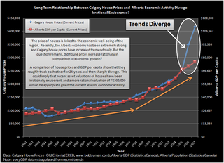
Radley showed that the 2006-2007 price appreciation went over and above any GDP growth here.


Ben at Financial Insights recently compiled a similar chart for the Canadian wide market.


The Edmonton Housing Bust Blog compared local condo prices to rents. In Don's momentum chart it shows that rent increases come first and then lead to higher prices. If this was applicable to the last boom this ratio should have fallen with higher rents initially then increase as prices caught up. Instead prices outpaced rents for the entire boom.


Now consider the Teranet Price Index at 3 points in time after the boom.

1) In mid-2007 there was positive GDP growth, a strong job market, population growth and rent increases. The 'Momentum Graph' would predict future price increases yet they were at their absolute peak.

2) In spring of 2009 GDP was lower after the oil bust and recession, combined with lower population growth and increasing Alberta unemployment. The 'Momentum Graph' doesn't go into reverse for obvious reasons, but if it did it sure wouldn't predict a bounce in prices.

3) In mid 2010 the Alberta economy and job growth have improved yet prices started trending down despite this.

Even if you accept some relation between GDP and house prices it is reckless not to mention that 2006-2007 was an anomaly. Don wants readers to make the connection with the GDP chart and another boom to pump his seminar, while being vague enough to provide future cover. Adding context is not helpful to his financial goals.